Last week Google announced the introduction of a ‘mobile-friendly’ label to their mobile search results. The label, which sits below the URL on Google’s SERP (search engine results page), is designed to improve the user’s mobile experience, by indicating which websites offer a good mobile experience and which sites do not.

Example of a mobile SERP result with the mobile-friendly label
Optimizing your website for mobile devices has been an important component of SEO for several years now. But following this news, its implementation is even more crucial, as Google has shared that ‘mobile-friendliness’ may eventually be used as a ranking factor for their mobile search results.
Although this ranking factor is yet to be confirmed, it would not be a surprising addition, given that since June 2013, sites offering a good (bad) mobile experience have been prioritized (demoted). And whilst the change is said to take a few weeks, we are already witnessing the label on many mobile results.
According to Google, a page will receive the ‘mobile-friendly’ tag in its listing, if Googlebot detects that the following criteria have been met:
- The page must not have software that is not common to or does not work effectively on mobile devices, such as Flash.
- The page should use text that is readable without needing to zoom in.
- Content on the page has been optimized to fit the size of the mobile screen, and therefore does not require horizontal scrolling.
- Links on the page should be spaced far enough apart so the desired link (such as navigation buttons, call to action buttons and other clickable elements) can be comfortably tapped.
Key Elements to Consider when Optimizing your Mobile-Friendly Website
The Mobile Usability Report in Google Webmaster Tools should be your first port of call for checking usability issues across your entire mobile site. The following elements of your site can be checked in the report.
Faulty Redirect
If a mobile website has been created, redirects must be put in place from every desktop URL to its mobile counterpart for users accessing the site via their mobile device. The common mistake of using a Faulty URL by redirecting users to the wrong page, or more commonly, to the home page when no mobile version of the page exists, should be fixed immediately. If the mobile URL of a desktop page does not exist, Google recommends allowing the user to access the desktop version on their mobile, rather than redirecting them to a completely different page.

Faulty redirects, as displayed in the Smartphone URL errors section of Webmaster Tools
Mobile Usability
Under the Search Traffic Section, the Mobile Usability report indicates elements of the site that are contributing to poor mobile usability. There are six primary errors that will be reported on if not implemented correctly, that go hand-in-hand with the mobile-friendly criteria mentioned above.
- Flash usage
- Viewport not configured
- Fixed-width viewport
- Content not sized to viewport
- Small font size
- Touch elements too close
Again, if these errors are reported in your Webmaster Tools report, they should be attended to promptly to ensure your users enjoy a better mobile experience and your site meets Google’s usability requirements.
How do I Know if my Website Meets Google’s Mobile-Friendly Criteria?
We recommend checking the mobile usability reports in Google Webmaster Tools first. Once you have accessed the reports, there are also two other Google resources that will help you check on the status of your mobile site, such as their Webmaster’s Mobile Guide and the new Mobile-Friendly Test Tool.
Test your Site with Google’s Mobile-Friendly Test Tool
By simply entering a page’s URL, Google will quickly show you if the page is mobile-friendly with an ‘Awesome! This page is mobile-friendly’ message, or not- ‘Not mobile-friendly’ message.

Take Note! Having utilized the tool to check our clients’ mobile sites, we can report that the status reported by the tool does not always correspond to the mobile-friendly label on the SERP listing or to the nature of the site itself.
Perform a Manual Test
As the results of the Mobile-Friendly Test Tool do not always match Google’s SERPs and the mobile-friendly labels (according to our tests), we recommend checking Google’s SERPs manually. Simply perform a mobile search for each ranked keyword and check if the result/landing page has been labelled mobile-friendly.
As an example, we tested the ‘mobile-friendly’ status of our client’s site, inside3dp.com:
Google’s Mobile-Friendly Test Tool shows inside3dp.com is not mobile friendly.

However, when performing a mobile search in Google for “inside3dp”, we see the homepage inside3dp.com has a mobile-friendly label. We also searched for “3d printing innovation” and again found Inside3dp’s SERP result and its corresponding landing page had the mobile-friendly label. Entering the pages, we also see the site has been optimized for mobile.

Mobile SERP results for search term: ‘inside3dp’

Mobile SERP results for search term: ‘3d printing innovation’
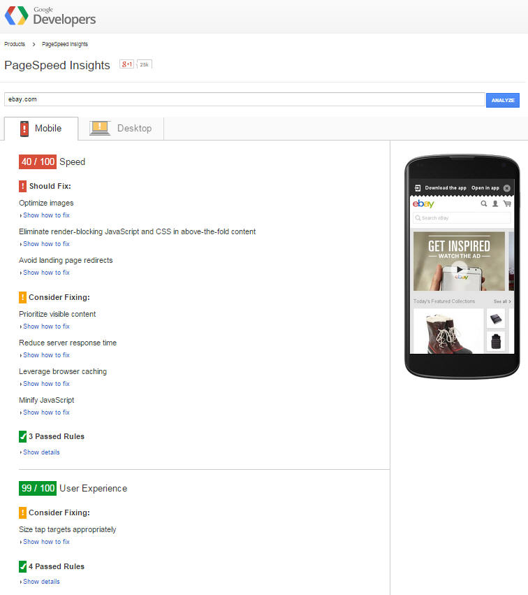
PageSpeed Insights
We also recommend checking your site’s results through Google’s PageSpeed Insights tool, which offers site speed and user experience insights for both desktop and mobile websites. Rating the page speed and user experience out of 100, the tool also lists elements of your desktop and mobile sites that require fixing.
Mobile Optimization: Responsive Design or Mobile Site?
If you are yet to optimize your website for mobile users, the question should not be if, but how to configure (responsive design, mobile site or dynamic serving) your mobile-friendly site.
If the question had been asked several years back, the quick answer may have been to implement a separate mobile site, enabling better targeting of on-the-go smartphone users. However, in June 2012, Google released their recommendations for building smartphone-optimized websites, stating that responsive design was their recommended mobile configuration. Dynamic Serving, a combination between responsive design and a mobile site, is also a smart option, but less common as it is more complicated to implement.
From an SEO perspective, there are benefits to both a responsive and a mobile site.
According to Emmanuelle Tene, SEO team leader at Seperia, a separate mobile website usually serves users with a higher quality on-page experience, as the site has been optimized specifically to target the needs of mobile users. That is, the keyword and topic targeting performed for the mobile site are different to the desktop site, with mobile targeting adapted for on-the-go users. Emmanuelle points out that this specific targeting offers great SEO opportunities, especially for local businesses. Furthermore, the 6 mobile usability elements mentioned above can be easily controlled through a mobile site, but may be harder to alter through a site using responsive design.
It is important to note that Google views the desktop and mobile sites as two separate websites, which may affect the mobile site’s SERP rankings if its SEO signals are not as strong as the desktop site’s. In this case, a responsive website will benefit from the pre-existing SEO signals of the desktop site by, for example, seeing a greater similarity between desktop and mobile organic rankings.
Google further explains the benefits of responsive design and why it recommends this mobile configuration over other options:
- Makes it easier for users to share and link to your content with a single URL.
- Helps Google’s algorithms accurately assign indexing properties to the page rather than needing to signal the existence of corresponding desktop/mobile pages.
- Requires less engineering time to maintain multiple pages for the same content.
- Reduces the possibility of the common mistakes that affect mobile sites.
- Requires no redirection for users to have a device-optimized view, which reduces load time.
- Saves resources when Googlebot crawls your site. For responsive web design pages, a single Googlebot user agent only needs to crawl your page once, rather than crawling multiple times with different Googlebot user agents to retrieve all versions of the content. This improvement in crawling efficiency can indirectly help Google index more of your site’s content and keep it appropriately fresh.
There are benefits and drawbacks to all three configurations, but the choice of which to implement will usually come down to a few factors, such as your budget, business goals for the site and most importantly- how different the content and experience should be for the desktop and mobile platforms, from the optimal user experience standpoint? For news sites, responsive design is a no brainer. But for a website offering a product, the decision needs more consideration and analysis.
Although mobile equates to a large piece of the search pie, the effect the mobile-friendly label will have on organic search results is still unclear. No matter what Google decides, one thing is clear. By optimizing your site for mobile users and making sure all mobile usability elements are satisfied, your site’s visitors will be more engaged as they enjoy a better on-page experience. And with these positive signals they will likely come back to your site more, which, with today’s Google ranking algorithm, counts a lot.
Postscript April 5, 2015: Google has announced that as of April 21, the mobile-friendliness signal will become a ranking factor across all languages, worldwide. Whilst the update may take a few days to a week to roll out globally, it will categorize sites on a ‘yes’ or ‘no’ basis. That is, there is no degree of mobile friendliness, your site is either mobile friendly or not. The tips and recommendations we offer above are now more relevant than ever. What has changed is the option to offer visitors a mobile-friendly site- it is no longer a question, but a must to keep your site ranking well and avoid being penalized on mobile search results.
Contact us to inquire about our services.